Aug 7, 2025
Pratik Tamhane
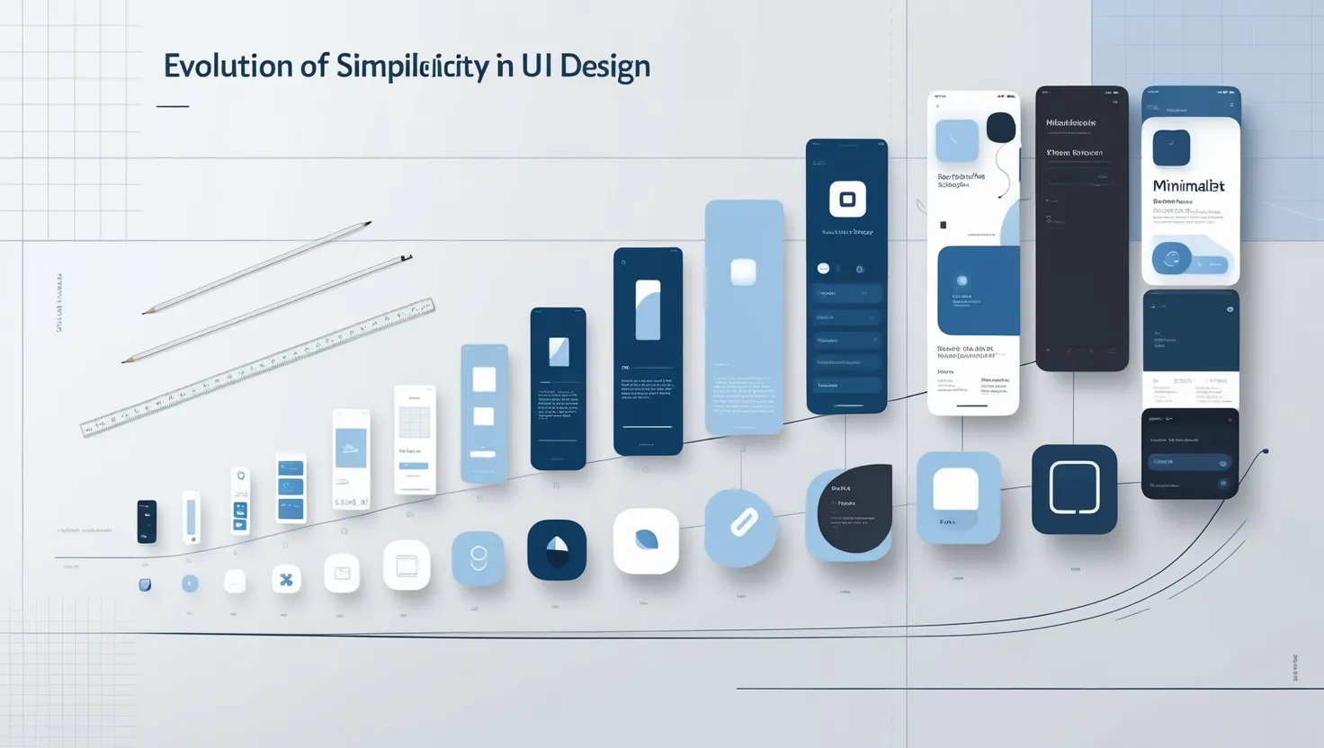
History of Minimalism in UI Design
Minimalism in UI design isn’t just a fleeting trend — it’s a timeless philosophy that has evolved across decades. From its artistic origins to its dominant presence in the digital world today, minimalism is a story of clarity, functionality, and beauty. I’ve always been fascinated by how this design approach has transformed over time, and I’m excited to walk you through its journey.
1. The Birth of Minimalism: Borrowing from Art and Architecture

Press enter or click to view image in full size
Photo by Rifqi Ali Ridho on Unsplash
Minimalism didn’t start with UI design. Its roots can be traced back to early 20th-century art and architecture. Movements like Bauhaus and De Stijl championed the idea of “less is more,” emphasizing functionality over decoration.
When I first stumbled upon Bauhaus, I realized how deeply it influenced modern design principles. The architects and artists of that era believed that every element in a design should serve a purpose. Clean lines, geometric shapes, and neutral colors became the foundation of minimalist aesthetics.
2. Minimalism Meets Technology: The 1980s and 1990s
Press enter or click to view image in full size
Photo by Glenn Carstens-Peters on Unsplash
As technology advanced, minimalism found its way into the digital realm. In the 1980s, personal computing was on the rise, and user interfaces (UIs) had to be simple enough for non-tech-savvy users to understand.
One of the pioneers of this era was Apple. Steve Jobs, influenced by his love for simplicity, pushed for clean, user-friendly interfaces. The original Macintosh interface, with its simple icons and minimal text, was groundbreaking.
When I think about this era, I imagine how intimidating computers might have been back then. Minimalism wasn’t just an aesthetic choice — it was a necessity to make technology approachable.
3. The Skeuomorphic Era: Early 2000s
Press enter or click to view image in full size
The Skeuomorphic Era: Early 2000s
Before minimalism truly took off, skeuomorphic design dominated the early 2000s. UI elements were designed to mimic real-world objects — think glossy buttons, textured backgrounds, and detailed icons. While it helped users relate to interfaces, it often led to visual clutter.
I still remember using apps with leather-bound calendar designs or buttons that looked like they belonged on a physical device. While charming, they often felt heavy and unnecessary.
4. The Rise of Flat Design: Minimalism Gains Momentum
Press enter or click to view image in full size
The Rise of Flat Design: Minimalism Gains Momentum
The real turning point for minimalism in UI design came with the rise of flat design in the 2010s. Companies like Microsoft and Apple started moving away from skeuomorphic elements, focusing instead on clean, two-dimensional layouts.
Microsoft’s Windows 8 Metro interface, introduced in 2012, was a bold move. It featured flat icons, vibrant colors, and a grid-based layout. Shortly after, Apple followed suit with iOS 7 in 2013, abandoning glossy, 3D-like buttons in favor of simplicity.
I personally think this shift marked a new era. It wasn’t just about aesthetics — it was about making interfaces faster, lighter, and more functional.
5. Minimalism as a Standard: The Present Day

Press enter or click to view image in full size
Photo by Timothy Hales Bennett on Unsplash
Today, minimalism has become a design standard. From Google’s clean interfaces to Instagram’s sleek app layout, simplicity is everywhere. But modern minimalism is more nuanced — it’s not about stripping everything down but about finding a balance between simplicity and functionality.
For me, the beauty of today’s minimalism lies in its thoughtfulness. Designers now focus on enhancing the user experience by removing distractions while ensuring that essential elements stand out.
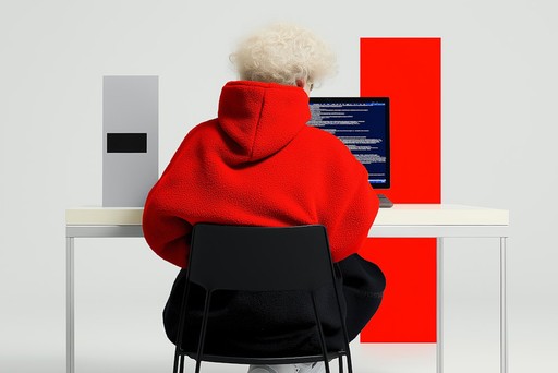
6. Why Minimalism Works So Well in UI Design
Press enter or click to view image in full size
Photo by Balázs Kétyi on Unsplash
I often get asked why minimalism is so effective, and here’s what I’ve realized:
Clarity: A minimal design eliminates confusion and makes interfaces easier to understand.
Focus: By removing unnecessary elements, users can focus on what’s truly important.
Speed: Minimalist designs load faster, which is essential in our fast-paced digital world.
Timeless Appeal: Trends fade, but minimalism’s simplicity makes it feel modern even years later.
Minimalism respects the user’s time and attention. That’s why it works.

Press enter or click to view image in full size
Photo by Christian Wiediger on Unsplash
Whenever I look at a beautifully minimalist UI, I feel a sense of calm. It’s as though the interface is speaking to me, saying, “Don’t worry, I’ve got you.” Isn’t that what design should do — make life easier?
However, minimalism isn’t a one-size-fits-all solution. It works best when paired with creativity and user-centered thinking. I believe that striking the right balance is what makes a design truly memorable.